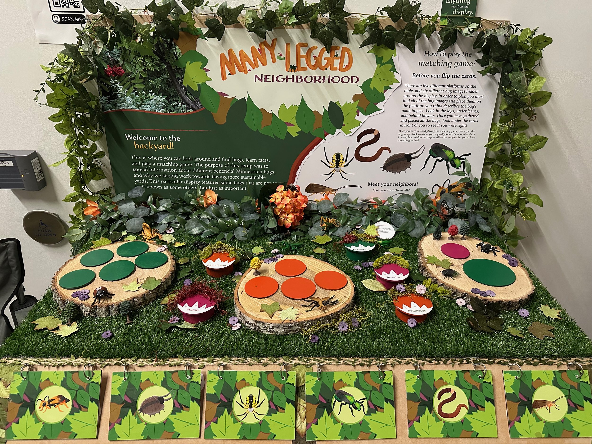
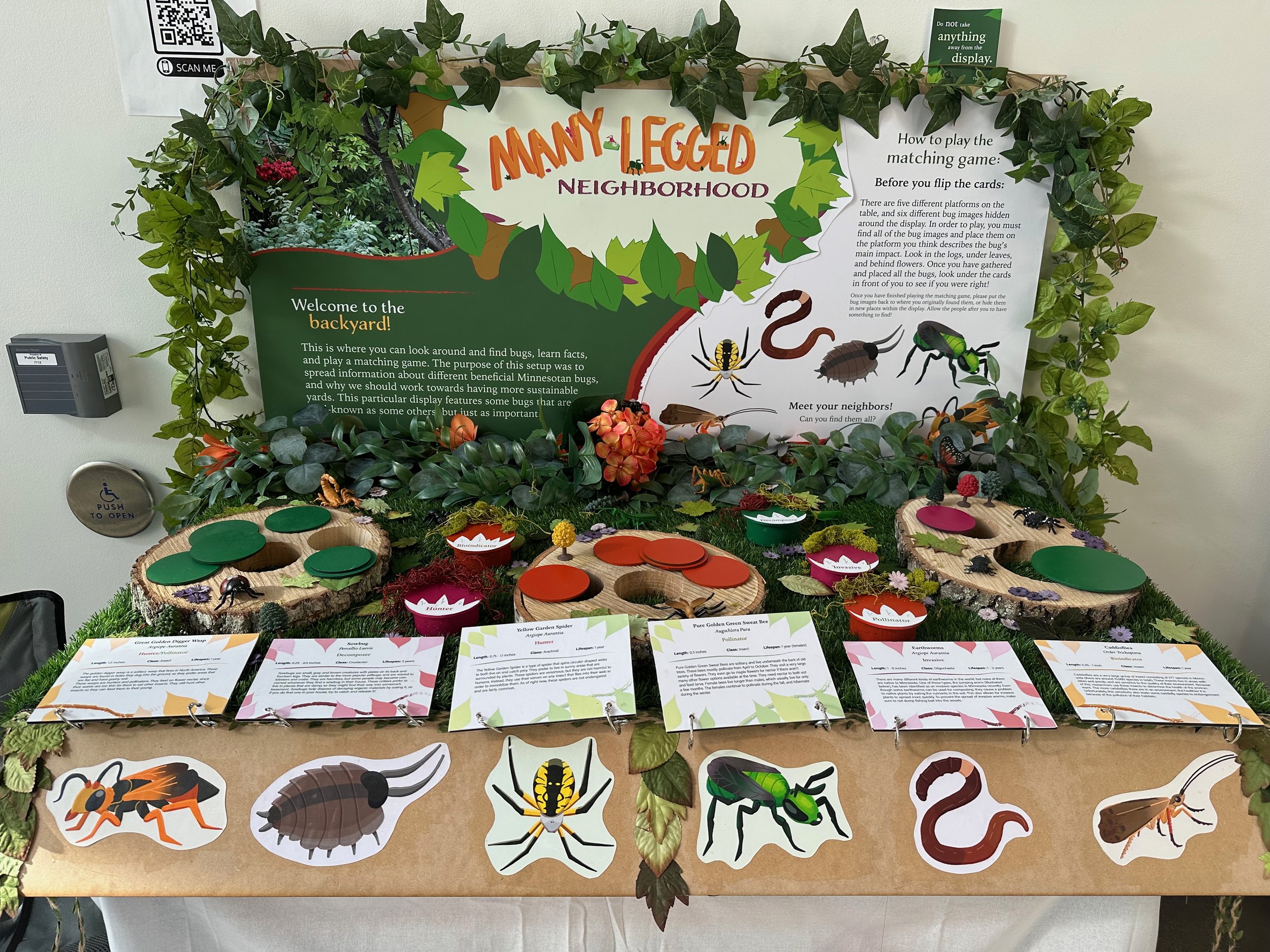
Small Critters and their Importance:
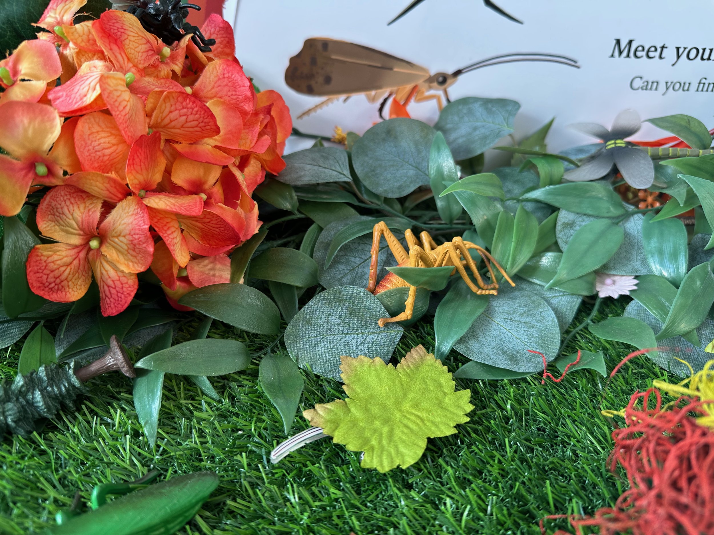
This display is inspired by my own yard, where I would observe the different plants and see all the small creatures living within them. I became very curious about them and their impacts on the environment. Because of this, I made my thesis paper about insects, and how design could be used to convince people of their importance. The display here is meant to have that exact effect, but instead of just insects, it features various Minnesotan critters. The main objective of this project is to introduce Minnesotan families to some of the creatures they may see in their backyards, and hopefully convince them that these creatures are worth protecting, and that they can learn to admire them.
The design is meant to draw people in. The colorful illustrations as well as the many movable pieces were made to be inviting and friendly. Visitors would be drawn to the display to lift up the lids on the logs, move around the bugs, and pick up some of the fake trees, but end up also learning about creatures in Minnesota.

The Thought Process:
Here I describe my thought process going into this project, as well as how exactly the display was supposed to work.


The Prototype:
This is the first physical mockup of the display. It uses a couple of different approaches for the same ideas. It consists of one main board with an illustration, two cutouts, and two different information cards. The original idea here is that visitors would simply place bug images on an illustration in the place that matches the bug’s behavior. For example, the flowers would have been for the pollinators, and the yellow insects would be for the hunters.
The two cards shown here were meant to test two different styles for the informational cards that would end up at the front of the display. One of them had hinges that allowed people to lift up one face of the card to reveal the other side. The other one was more like a proper card, where people could easily flip it around to look at the other side.
The two different cutouts allowed me to experiment with how thick I wanted each bug image to be. One was made out of MDF, while the other was simply paper.
I liked the idea of lifting up pieces and placing them elsewhere, but just having a single illustration in the middle of a large table to place bugs on did not seem immersive enough. This eventually evolved into a more three-dimentional experience.


The Neighbors:
In the prototype, I already chose to feature the Great Golden Digger Wasp and the Yellow Garden Spider in my display. This was because those two were creatures I remember seeing in my own yard. I wanted to add four more critters though, so I went to multiple sources to find them. I did some research on Minnesota bugs, as well as asking the UMN department of entomology and UMN insect club for recommendations.
I wanted to feature one invasive species because I wanted to bring attention to the topic. The UMN department of entomology told me about how jumping worms were considered invasive in Minnesota, and after doing some research on them, I found out that they were a type of earthworm, and that there were no native species of earthworm in Minnesota. This came as a surprise to me, since I remember being told that earthworms were beneficial. The sowbug was chosen because I remember seeing one of them in my dorm room one time, so I instantly recognized it when I was searching for decomposers. I chose the caddisflies to inform people about bugs that can be used as bioindicators. Finally, I chose to feature the sweat bee because it was a type of bee that most people wouldn’t think about when thinking of a bee. It is a very unique insect because of how it looked.
The illustrations I used for the display are meant to be accurate enough for people to tell what type of critter they are, but also simple enough for the appearance to not potentially frighten some viewers. The simplicity of the style is meant to get rid of some of the discomfort some people might feel when thinking about bugs, and allow them to gain an appreciation for these creatures.


Information Cards:
These cards use two different typefaces: Iowan Old Style for the larger text, and Acumin Variable Concept for the smaller text. I thought old style was a good fit for the natural feeling the display had, and Iowan Old Style had calligraphic elements, but was simple enough to be read at a smaller size. Acumin Variable Concept had a lot of versions, involving condensed versions with different weights. This made it readable even when it was very small in size, as well as giving me options for hierarchy. I arranged these two fonts in a simple grid. The top half shows some labels for the bug, while the lower half involves a short paragraph (or paragraphs) informing viewers about the bug. The viewers are meant to read the upper-half first, which is done by adding a bigger variety of fonts up there, as well as centering some of the text, which contrasts the left-leaning body text.
The visuals on the cards reflect the more friendly mood of the display with its bright colors and organic shapes, as well as having similar elements to the front of the cards, which consists mostly of leaves.


Backboard:
The backboard sits behind the fake environment on the display. It is meant to be the first thing people see, so it introduces the display to them. On the top, it shows the title/logo of the project. This introduces viewers of the main topic as well as the general tone, which is a bright and fun display about bugs that could be found near you. The text on the left go into more detail about the purpose of the display, adding on to the information already given by the title. The text on the right explains how people would play the game that is added into the display. Below that are illustrations of each of the bugs they would need to find within the display.
This board reuses the Iowan Old Style typeface from the cards. Since this board is large in scale, the more condensed typeface was not needed to maintain readability. Another typeface was used, which is Adorn Roman. It is similar to Iowan Old Style, but it has a more calligraphic look as well as a subtle texture. This typeface works a lot better on a larger scale, and the texture adds to its importance in the hierarchy. The text for part of the title was hand-drawn in a style that is meant to mimic the style of the bug illustrations, while the second part of the title uses Adorn Expanded Sans. This typeface is similar to both Adorn Roman as well as the hand-drawn text, which is why it was chosen.

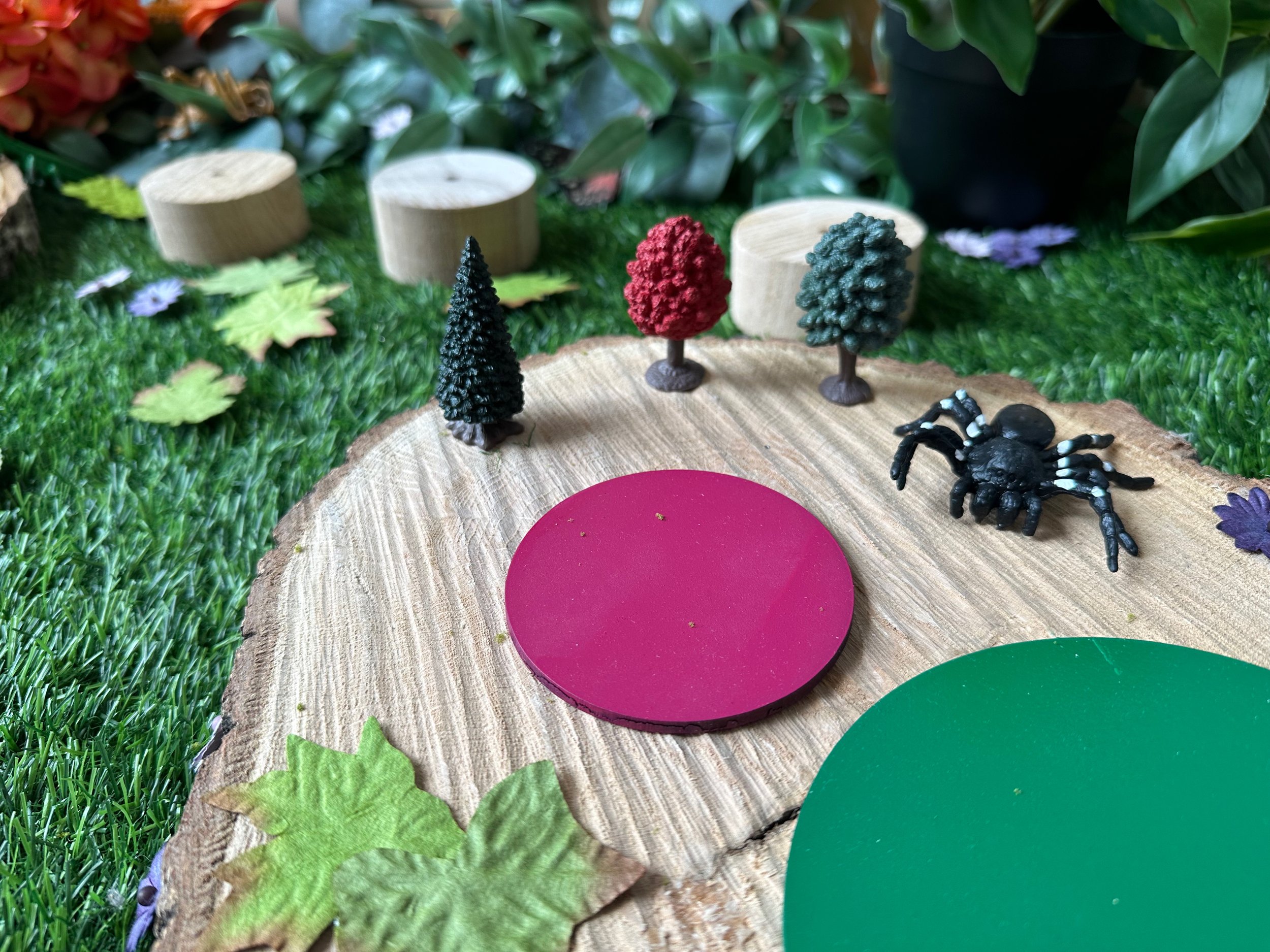
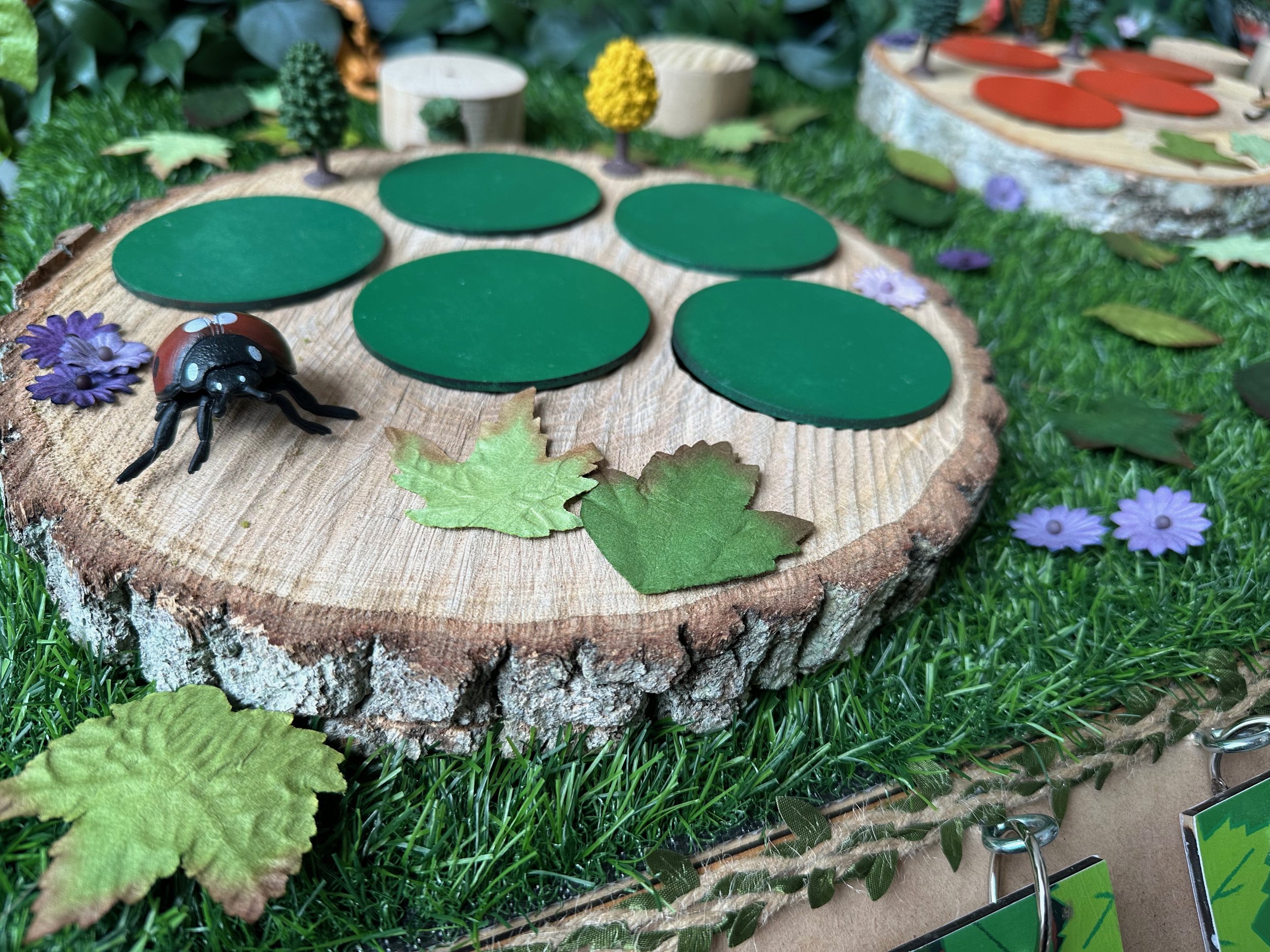
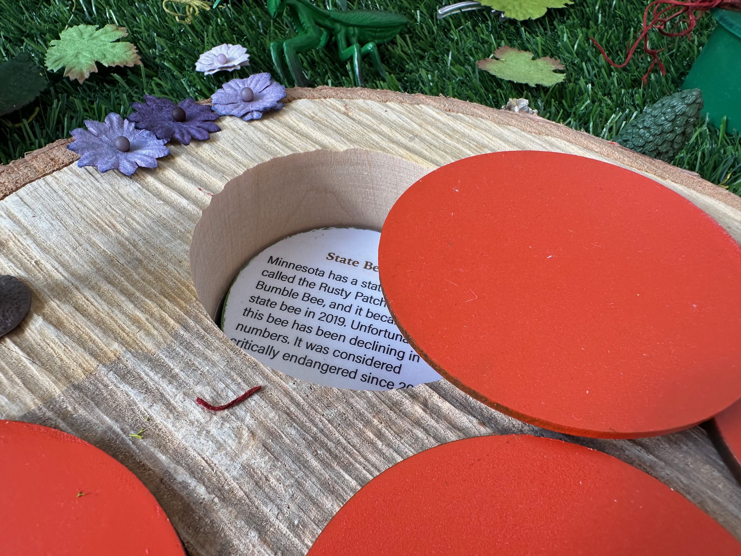
Platforms:
I created five pedestals using wood, MDF, and spray paint. They each have words on them that are identical to the words shown on the underside of the information cards (pollinator, hunter, bioindicator, decomposer, and invasive). This is to create a connection between the two pieces, and allow people to quickly determine whether or not they were correct in the matching game.

What Can You Find?
Shown on the right are all the bug images and short facts visitors could find within the display. People are allowed to find these, and then hide them in other parts of the display for the next visitors. It rewards people for being curious and looking in every log and under every leaf.
Images: